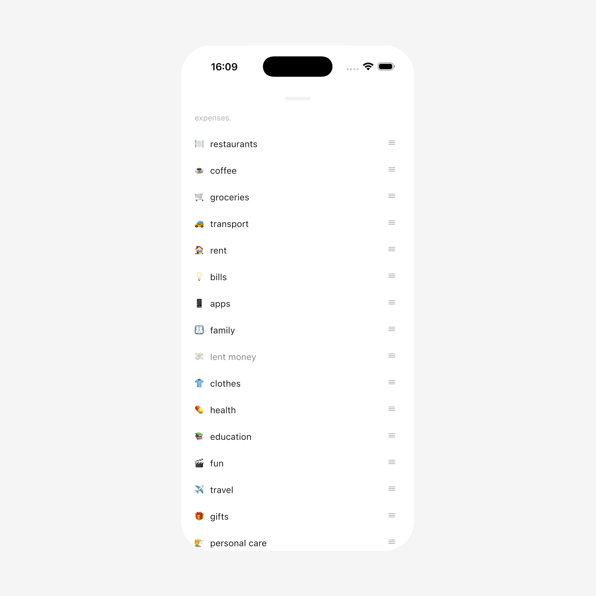
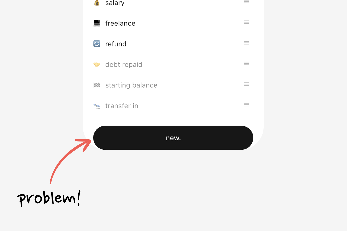
It looks fine. But scroll to the end, and the button is stuck to the bottom with no breathing room, and the bottom system bar overlaps it:
First thought: "That's why SafeArea exists!" Wrap the content with it:
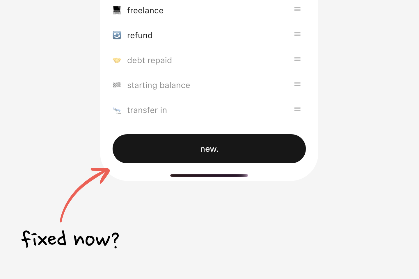
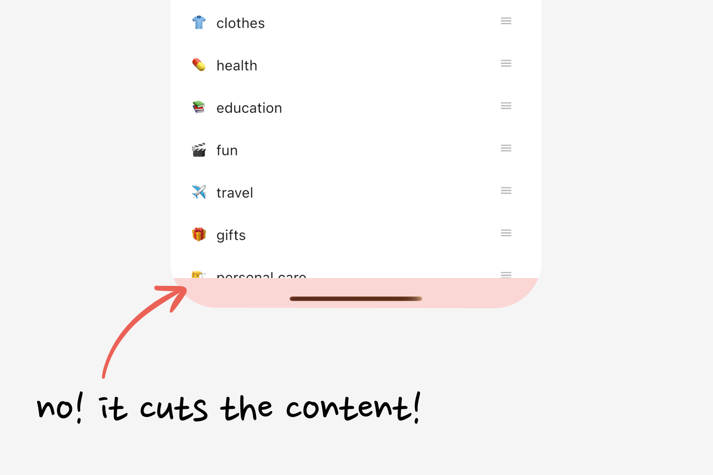
Problem looks fixed now. But no, it isn't. Sure, that fixed the button sticking to the bottom, but scroll the page now and it becomes clear: SafeArea just told the list "Hey, don't render your items after this line, OK?!" So, category items get cut off. But that doesn't look good:
Remove SafeArea and rethink. The device has a system bar at the bottom, and the goal is simple: breathing room only at the bottom, so content doesn't stick to the edge. The solution: add bottom padding in the size of that system bar, right?
Meet BottomPadding:
import 'package:flutter/widgets.dart';class BottomPadding extends StatelessWidget { const BottomPadding({super.key}); static double of( BuildContext context, { double minimum = 16, }) { // Get size of the bottom system bar final double viewPadding = MediaQuery.viewPaddingOf(context).bottom; // Use the system bar size if it's bigger than the minimum, // otherwise fall back to the minimum. final double height = viewPadding > minimum ? viewPadding : minimum; return height; } @override Widget build(BuildContext context) { final double height = of(context); // Return a box of that height. return SizedBox(height: height); }}
BottomPadding does more than expected. An example:
Here, BottomPadding sits as the last child of the Column, and it helps in two cases: (1) it gives breathing space on devices with a bottom system bar; (2) if there isn't one, it just adds a 16px box, so content still doesn't hit the bottom edge. Perfect!
A fair question: "Why not just use padding: .all(24)? It'd add enough padding to all sides to avoid system insets." Because the bottom system bar isn't always 24px. BottomPadding calculates it dynamically. The two combine nicely: